Cewlrency: Icon drafting
So the old Cewlrency icon that I made using Roman Nuriks tool isn’t really triggering the must-have feeling I’m after. The icon for Cewlrency (that will btw change name) must look modern, describe what the app does and all in all look spot on. There’s no room for simple boring shapes when users scroll past the app in the endless Google Play search result. It must draw attention.
Material design
Material design can easily get a tad outright yawningly boring. It’s all flat, shadeless and most of the time a bland pile of nothing. Depends on the designer I guess.
I started out trying to break the material trend and give the icon a flashy look. It ended up looking quite cheap and gameish.
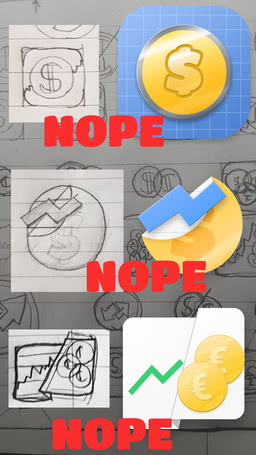
I wanted to skip the flat material feel to make my golden coin stand out, but the result wasn’t that satisfying. Probably due to my lack of interest halfway through the designs lol. I decided to go full material and voila, the icon looks surprisingly good. Gotta give it to the Google Design team, material design is damn good. It’s so good even a rookie three-times-in-a-year designer like myself can produce a great icon;
Animation
I aim to create an intro animation for Cewlrency where this icon kind of pops out of nowhere while spinning and splitting and what not. Lottie is going to be put to the test.